My wife and I recently became fans of Dominion. We like how every Dominion game can be different — different strategies, different pace, different level of aggression — based on which cards you choose to play with. There are 205 total released Kingdom cards. Each game only requires 10 Kingdom cards, so there are over 28 quadrillion potential games that we could play.
Some of those combinations will be lots of fun and worth repeating. Others will involve cards that don't go well together and don't lead to enjoyable games. I decided that it would be nice to find an app that could help me pick good game combinations and help me remember which ones I like the most. After searching through the App Store, I found three to try: Dominion Deck Builder, Dominion Vault, and Adept. I downloaded all three, to compare and find out which one would work best for me.
Adept


Pros
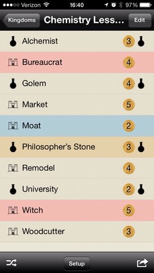
I was initially disposed to like Adept. The layout is simple, elegant, and very readable. I like the clear icons, on the left of each row, to show which expansion the Kingdom card is in. I like the coin, on the right of each row, to show how much each card costs. And I like the color coding, to indicate which type of card it is (Victory, Treasure, etc).
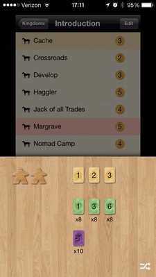
My favorite feature is the Setup display. It shows how many Victory, Treasure, Curse, etc cards you need to go with your chosen Kingdom cards. Additionally, it shows the correct quantity of cards for a 2 player game up through a 6 player game. This is a really nice feature, to make it easy to not only pick Kingdom cards but to quickly know how else you need to set up your chosen game.
Cons
Visually, this is my favorite app out of the three, but it has a fatal flaw. The app will show you which card to put in your game, but it doesn't show any information about what the card is or what game features it enables or disables. Unless you have all of the cards memorized (and I don't), you'll feel like you're picking blindly. That lack of information makes this app a no-go for me.
Dominion Deck Builder


Pros
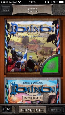
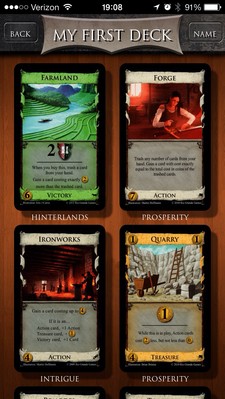
Based solely on app descriptions, this would be my favorite app — it's the only one to have both an iPhone and an iPad version. The interface is gorgeous, with plenty of high quality artwork taken directly from Dominion. You start by scrolling through a list of expansions and choosing which ones to use to generate your Kingdom.
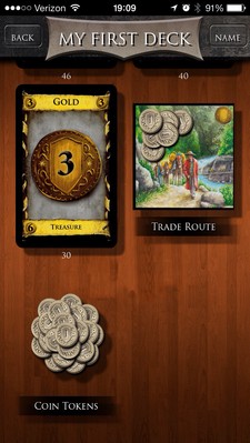
Once you've generated a Kingdom, you can scroll through the chosen cards and see each one represented as a high quality image, along with which expansion it's found in. At the bottom, you can see the required setup for this game, complete with whatever token pieces, trade route pad, treasure cards, etc are needed. The information is very useful and the graphics make it absolutely clear what you're looking for.
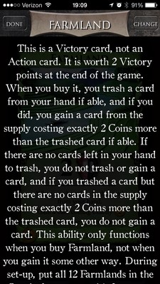
Finally, you can view close ups of each card, to review how it works. If you tap on the card, you get a text description of the card and all of the minutia about how it can and can't be used. Tapping on the text takes you back to the card view. The "Done" button will return you to the list of all cards and the "Change" button will immediately swap the card for another randomly chosen card.
Cons
Dominion Deck Builder does have two drawbacks. It has limited support for configuring how your Kingdoms are randomly generated. You can choose which expansions to draw from. You can choose to always add Reaction cards if the Kingdom includes Attack card. You can choose certain card types to exclude all together. Finally, you can choose to track cards so that cards that have been chosen for one game won't be chosen again in a future randomly generated game. This can help you play through the various Kingdom cards and have a chance to experience everything at least once.
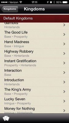
It's also hard to browse and find saved Kingdoms. The app comes preconfigured with all of the recommended Kingdoms from each expansion. These are presented in one giant list, alphabetically ordered. There's no way to view just Kingdoms from a particular expansion or just my custom Kingdoms. In fact, my custom Kingdoms are mixed in with the rest, making it hard to find them and zero in on my favorites, unless I remember their individual names.
Dominion Vault


Pros
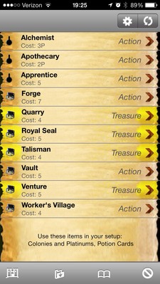
This app frustrates me. It's both the ugliest app out of the three and the most powerful app of the three. It opens immediately, to a randomly generated Kingdom. The display packs a lot of information. The far left side of each row shows an icon representing the expansion the card is found in. The middle shows the name of the card and the cost. The right side shows the type of card. The splashes of color on the left and right sides further serve to indicate which type of card this is. The setup section, at the bottom, tells you if you need any extra cards or pieces for this game.
You can tap on a row to lock it. If you do, you'll see a lock icon, in between the card type and the right pointing arrow. This is useful if you like part of a generated Kingdom but not the entire thing. You can quickly tap to lock the rows that you do like, then hit the refresh button to replace the rest with randomly generated replacements. Doing this will allow you to iteratively construct a deck that you do like.
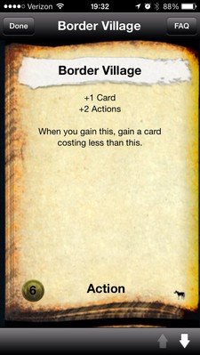
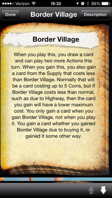
You can tap on the right arrow to view more information about the card. All of the essential information from the actual Kingdom card is included. Additionally, you can press the FAQ button to view more detailed information about the card, including when it can and can't be used and exactly how it can be used.
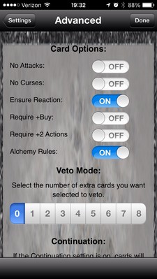
The real strength of Dominion Vault is in the Advanced settings. You can choose which types of cards to include, require games to include cards that have extra Buys or extra Actions, and play with or without Alchemy specific rules. You can also track cards so that Kingdom cards aren't reused between games and you can choose how Black Market decks are generated.
Cons
Unfortunately, this app has almost as many things that I don't like as it does things that I do like.
Low Quality Graphics — The overall problem is that none of these graphics appear to be retina quality. The icons representing each expansion are very fuzzy and can make it hard to tell which expansion a given card comes from. The icons for Intrigue, Prosperity, and Hinterlands are particularly bad. The graphics representing the refresh button and options button are similarly fuzzy and low quality.
Hard to Use — When viewing the Kingdom, you have the option of tapping to lock a card or tapping to view detailed information about the card. Unfortunately, the default tap locks the card. Tapping anywhere in the row activates the lock. In order to view card information, you have to tap directly on the right arrow. This is not as easy as it should be and makes it harder than necessary to view card details. I'd prefer to have the behavior switched around so that tapping anywhere in the row shows card details and tapping on the right side locks the card. (And heaven help you if you try to tap the uppermost right arrow, miss, and hit the refresh button instead. You'll suddenly get an entirely new set of cards.)
Boring — The app doesn't have any graphics directly from Dominion. Instead of nice looking representations of each card we get bland textual descriptions. Sure, the information is there, but it's not attractively presented. The app also doesn't support many swipe gestures. It would seem natural to swipe up or down, to move between cards in a Kingdom. It would likewise seem natural to swipe left or right to toggle between the card details and the card FAQ. Instead, you are forced to navigate solely through button presses.
Verdict
I'm torn between Dominion Deck Builder and Dominion Vault more than I should be. I like the options available in Dominion Vault. It appears to be the app that would generate the best decks. But it's very hard to overlook the poor quality graphics and the usability problems. They really make the app seem cheap. If Dominion Vault had crisper icons (like the ones from Adept) that would help a lot. I'd also recommend making the individual rows larger (for easier tap targets) and finding a way to make it easier to view card details while still keeping the lock feature accessible.
I love the graphics in Dominion Deck Builder. That, combined with the iPad app, makes this the best looking of the three and the one that serves as the best companion to an actual on-going game. I'd like to see more advanced options for generating games and better organization options for saved decks. Give me that and I think this app would be about perfect.
I'm leaning towards using Dominion Vault to generate my Kingdoms and Dominion Deck Builder to save the Kingdoms, view them, and see setup details for each game. Preferably one of these two apps will step up and make the necessary improvements so that I can be completely happy with either one.
