Workers Get the Same Slice of the Pie as They Always Have →
I'm always fascinated by the type of analysis that Scott Winship does here. There can be a huge difference in results, depending on how you look at things. This is one reason that I don't like to trust "common sense" all that much.
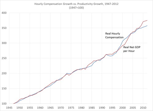
A couple of posts ago, I showed that when analyzed properly, hourly pay has risen just as much as productivity since 1947. The keys to getting the analysis right are to
- Compare mean hourly compensation (not median compensation, and not wages net of fringe benefits or household income) to productivity,
- Compare the same workers and sectors of the economy when computing compensation and productivity,
- Look at the nonfarm business sector to exclude the housing sector (where imputed rent to homeowners is counted as income) and the government sector (where indirect taxes are counted as income) so that income sources that do not reflect the value of what workers produce are excluded from productivity,
- Use net GDP to compute productivity rather than GDP, so that income taking the form of depreciation–which does not go to workers or owners but will simply affect future productivity–is excluded from productivity, and
- Use the same inflation adjustment for both compensation and GDP.
I should have added to that list that proprietors’ income (income from one’s business) should also be excluded, as it is not at all clear how to allocate that category into income from labor and income from capital. I have updated the earlier post (and chart) to take this into account. When these guidelines are followed, the results indicate that hourly compensation is almost exactly where it should be if we expect it to rise with productivity:
